Storywall
General introduction
With the Storywall you can make your homepage more colorful and playful. Place lots of exciting content at a glance and in cards of different sizes so that your candidates engage with your employer brand longer and more intensively. Whether it's short testimonials, links to specific jobs, exciting videos or pictures from everyday work - the Storywall is versatile and can be used at any position on your JobShop homepage.
Storywall
The Storywall consists of Storywall Cards of different sizes that are joined together to form a module.
Illustration

Storywall - Cards
Element view


Types

Text color

Hover effect
Content position
Editing in Recruiting Home
Storywall

| Fieldname | Description |
|---|---|
| [1] Internal Title (required) | This title is not displayed in the JobShop. The title is only visible to you and helps you organize, sort and edit the different content modules. |
| [2] Show example | These images show an example of the visual appearance of the content module and serve as orientation and assistance for creating and editing such a content module. |
| [3] Add Storywallcard | Will not be visible until the storywall has been created. |
Storywall - Card


| Fieldname | Description |
|---|---|
| [1] Internal Title | This title is not displayed in the JobShop. The title is only visible to you and helps you to organize, sort and edit the different content modules. |
| [2] Show example | These images show an example of the visual appearance of the content module and serve as orientation and assistance for creating and editing such a content module. |
| [3] Text content | Here you can insert the text |
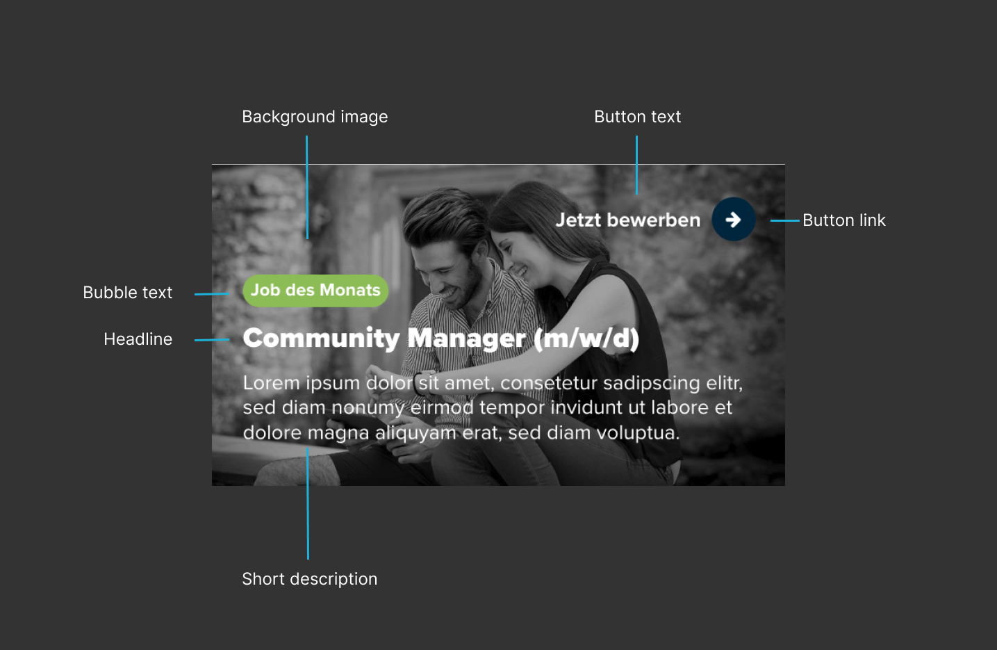
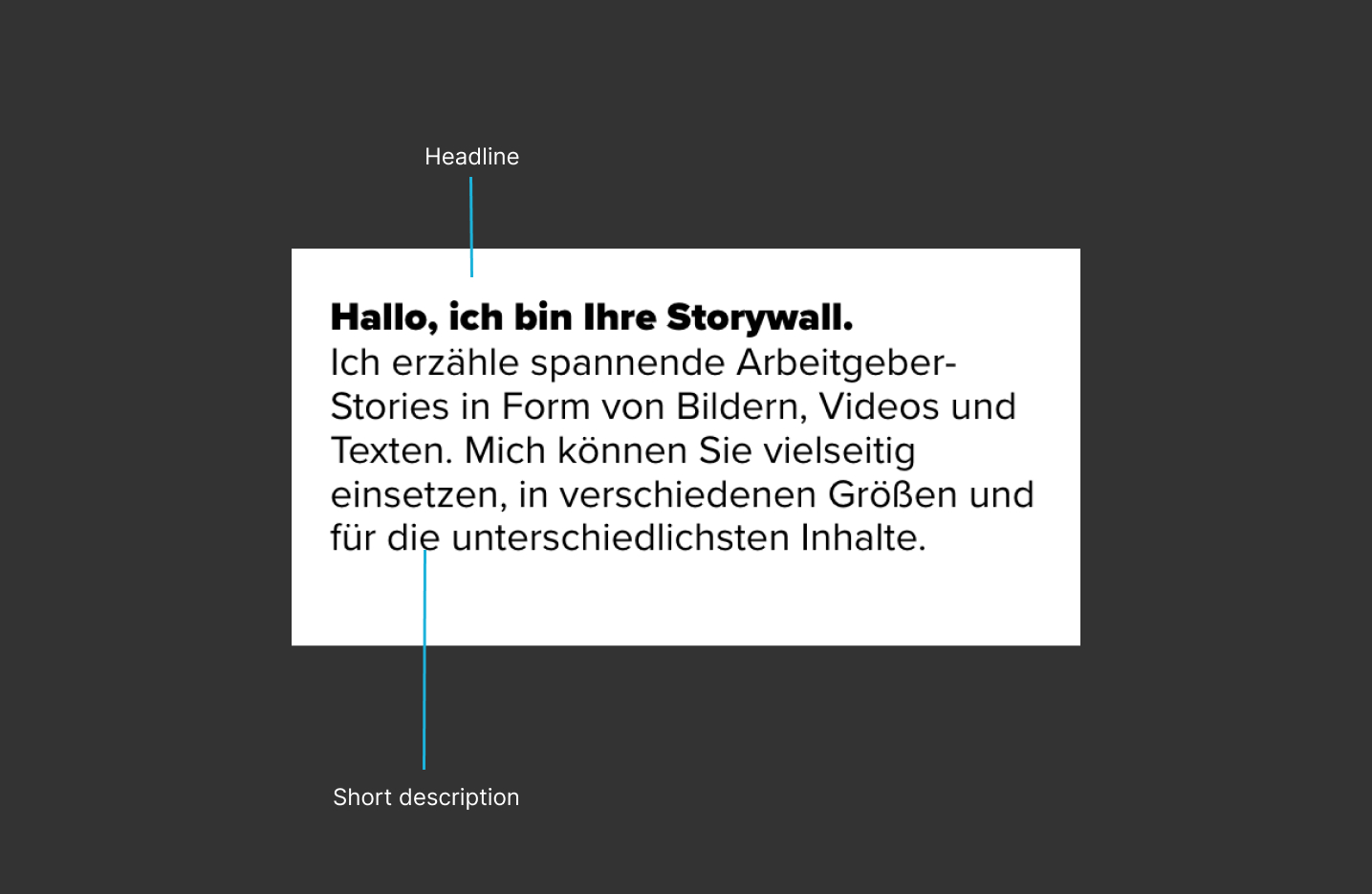
| [4] Headline | Headline of the card |
| [5] Subline | Subline of the card |
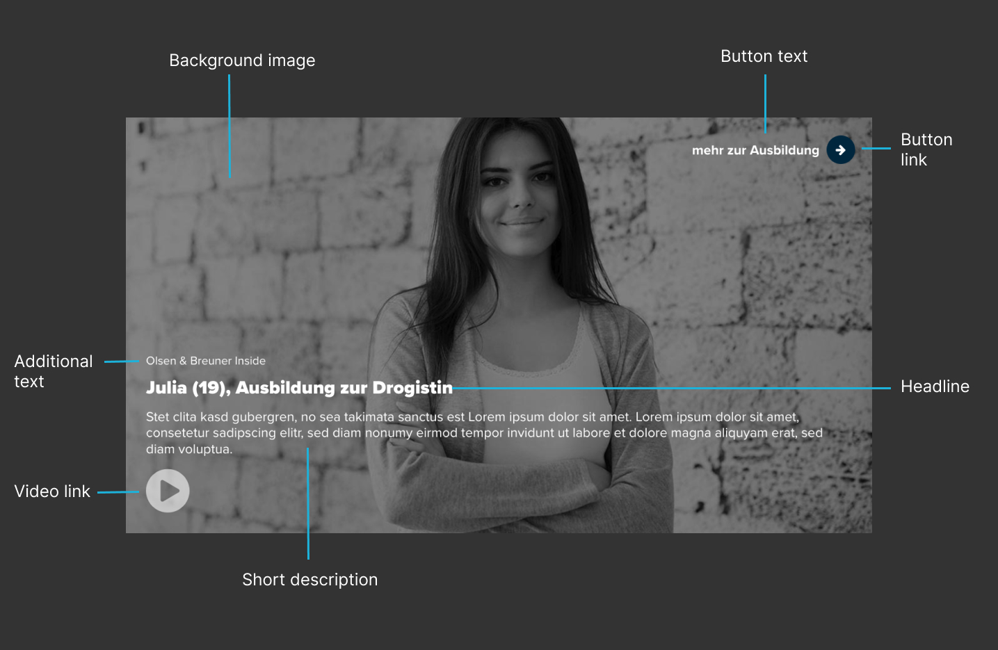
| [6] Short description | Short description of the content (recommendation: max. 250 characters) |
| [7] Bubble text | Text to be displayed in the bubble (recommendation: max. 30 characters) |
| [8] Additional text | Additional text (recommendation: max. 30 characters) |
| [9] Background image for card |
|
| [10] Video (required) | Choose one of the following sources or platforms for your video:
Other source with link to the video: Enter the full URL to your video. The URL to be entered must always contain the full path to the video and end with a common video file format such as .mp4. Default: no video |
| [11] Button text | The text of the button should clearly describe the action that candidates can expect when they click it. The text should be as short and concise as possible (e.g. "Join now", "Learn more", etc.). |
| [12] Button link | Select one of the following options for linking the card. If you do not select a link, no button will be displayed:
Default: no link |
| [13] Size of the card | Options:
See also the examples for the content module to better understand how the size of the card affects the appearance. |
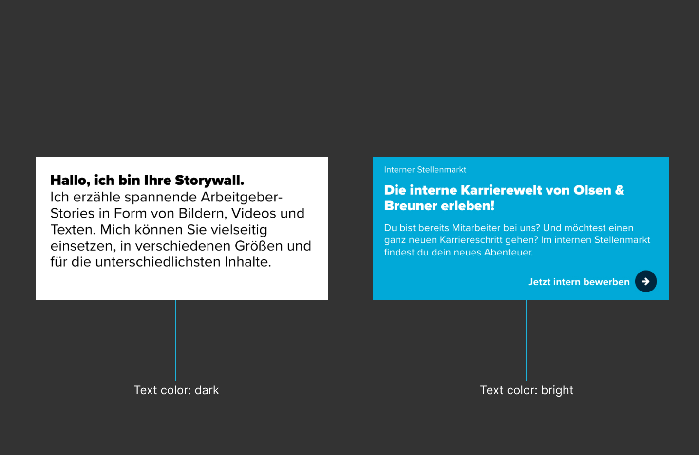
| [14] Text color | Options:
For example, if you use a very light background for the card, you can change the font color to dark so that your texts remain legible. |
| [15] Background color for card | Is determined with hexadecimal code:
If you don't want to use a background image for your card, you can simply set a background color here. If you already have a background image, it will be displayed instead of the background color. |
| [16] Show animation | This setting ensures that the card zooms in briefly when hovering with the mouse and changes its color slightly. This indicates to candidates that the card is clickable, e.g. for a video or a link. If neither a video nor a link is stored for this card, the setting should be deactivated. Default: activated |
Was this article helpful?
That’s Great!
Thank you for your feedback
Sorry! We couldn't be helpful
Thank you for your feedback
Feedback sent
We appreciate your effort and will try to fix the article