Think of your JobShop homepage as the shop window for your company's career world. A shop window always shows the most important things to get people excited about the products at first glance. Use your homepage to tell a short story that makes people want more – especially the goal of applying for a job.
You can quickly and easily edit your JobShop homepage yourself using the Page Manager. This guide is more than just a manual – it's your key to a successful JobShop. You'll learn step by step how to make the most of the Page Manager and turn your JobShop into a distinctive experience for applicants. With practical tips and proven strategies, this guide helps you implement your ideas quickly and efficiently. Among other things, you'll learn:
Maximum flexibility: Learn how to customise your homepage and other pages to present your brand in the best possible way.
Successful candidate engagement: Learn how to place content and use visual elements to convince applicants at first glance.
Inspiration and creativity: Get inspired by numerous examples and ideas to make your JobShop unique.
First impressions count
Imagine you're entering a new company to find out more about your career opportunities there. The entrance hall is your first impression – it tells you who the company is, what makes it special, and why it's worth working there. First impressions are especially crucial when job seekers are actively looking for a suitable company and find your careers page via Google. For many applicants, the homepage is the first point of contact with your employer brand, and it will often be the starting point of their entire candidate experience. This means there is enormous potential here to tell the right, clear and convincing story – the story of your company as an employer.
Getting the story right: Who, what, why?
To immediately engage candidates, the homepage needs to tell a concise (short) story that answers the key questions "Who?", "What?" and "Why?":
Who are you as a company?
Make it clear which values and culture shape your company. Are you an innovative tech startup, a family-run traditional business, or an international corporation with a wide range of career opportunities?What do you offer?
This is about presenting your key career opportunities. Are you looking for talent in IT, sales, marketing or production? Do you offer programmes for entry-level candidates, interns or executives?Why should someone apply with you?
What makes you an attractive employer? Do you offer flexible working hours, training opportunities, an inspiring work environment or special benefits?
A well-structured and clearly worded homepage should answer these questions and trigger a mental process in visitors:
Grab attention: Make it immediately clear why someone should keep reading – e.g. through a keyword-optimised headline or a strong visual element.
Spark interest: Show what makes your company special and why it's worth finding out more. Make the next step towards applying attractive and tangible – whether through personal success stories, exciting job openings or insights into your company culture.
Drive action: Encourage candidates to take action – whether that's viewing an open position, learning more about your team, or starting the application process directly.
Target audience focus: the right story for the right people
It's important to be clear about which target audiences you want to address and which specific goals you're pursuing. Of course, the main goal of "more and better-matched applications" is central, but it's equally important to break this goal down for different target audiences. A homepage that tries to appeal to everyone often fails to properly appeal to anyone.
Digression: What if you designed your own careers page like an online shop?
Let's briefly think about the design of an online shop. Every one of us has shopped online before and had good or bad experiences doing so. We've all asked ourselves questions like "How do I find what I'm looking for?", "Do they even have what I need?" or "Where's the product I saw the other day?". The challenge is to design a homepage that effectively covers different target audiences, different career paths and a wide range of information. The goal is always to guide candidates towards the most important action: applying.
Your JobShop homepage needs to be designed in exactly the same way. It must cover diverse interests and needs while still being focused enough to guide visitors towards applying. This is where you need to find the balance: just like in an online shop, the homepage should be structured so that the different career opportunities can be found quickly and intuitively, while still presenting your overarching employer brand clearly and convincingly.
Design: give your content sections the space they need!
Your content needs room to breathe – especially on a careers page, where clarity and structure are crucial. It's tempting to pack as much information as possible into a small space to keep the page compact. But this often results in content blocks looking cramped and having little spacing between them.
For applicants, however, this spacing is crucial. When they're looking for a new career challenge, they typically scan the page for the most important information – they don't read every word. Clear, well-defined sections help them orient themselves and quickly grasp your page's key messages.
By leaving enough space between sections, you allow visitors to refocus and grasp the most important information at a glance. This increases usability and raises the likelihood that they'll stay on your page longer and ultimately apply.
Structure headings and text hierarchically – for maximum impact
In your JobShop, the right structure is crucial for guiding applicants purposefully through your content. Think carefully about which key messages you want to convey on your homepage – and design them so they immediately catch the eye. The rule here is: the most important statements belong in the headings.
Think of your JobShop as a map that guides applicants through the story of your company and your job openings. The headings act as signposts, showing the fastest route to the most important information. In a world where attention spans often last only a few seconds and "information overload" is everywhere, it's crucial that your key messages spark interest immediately. Only then will visitors be willing to engage with the details and specific offers. The first heading on a page must get straight to the point about the page's content and include the relevant keywords – for better understanding by users and optimised visibility in search engines.
Example: Let's say you're looking for new talent in software development, marketing and sales. A hierarchically structured homepage could look like this:
Main heading: "Shape the digital future with us – your career at [Company Name]"
Subheading for software development: "Code innovative solutions – become part of our development team"
Subheading for marketing: "Implement creative strategies – unlock your potential in marketing"
Subheading for sales: "Write success stories – strengthen our sales team"
This structure ensures the most important messages immediately catch the eye and guide visitors towards the information relevant to them. The main heading conveys the overarching message, while the subheadings specifically highlight the different career opportunities. This way, you ensure that no important information is overlooked and that users find exactly what they're looking for.
If, on the other hand, the heading were vague, such as "Welcome to our careers page" or "Discover your opportunities", this could leave applicants uncertain and reduce the chances of the page appearing in search engine results.
Remember: Your first heading shouldn't just be a door – it should be an open door that shows visitors they're in the right place to take the next step in their career. In the world of job searching, first impressions count more than anywhere else. If you manage to speak directly to applicants and make them feel they can shape their professional future here, you've taken the first important step towards winning the best talent for your company.
Which elements should never be missing from the homepage?
Start area
Module recommendation: Start module

This is users' first impression of your homepage. The first heading is the most relevant heading for Google. It should include your company name and relevant keywords (e.g. jobs, careers, or something even more specific)
The call to action should take users directly to the jobs.
Company introduction
Module recommendation: Text module, Image + Text
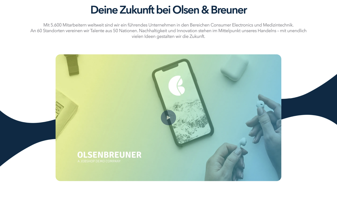
State the key facts about your company. Answer the following questions:
How many employees work at your company?
What industry are you in?
What makes you unique?
Use a maximum of three to five sentences for the introduction.
Departments/entry levels
Module recommendation: Job category overview, Cards
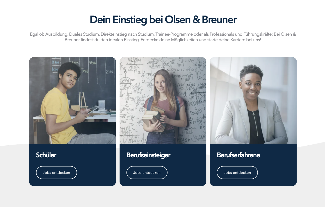
Make it easy for users to navigate to jobs by linking to departments or by pre-filtering by entry level.
Benefits
Module recommendation: Benefits
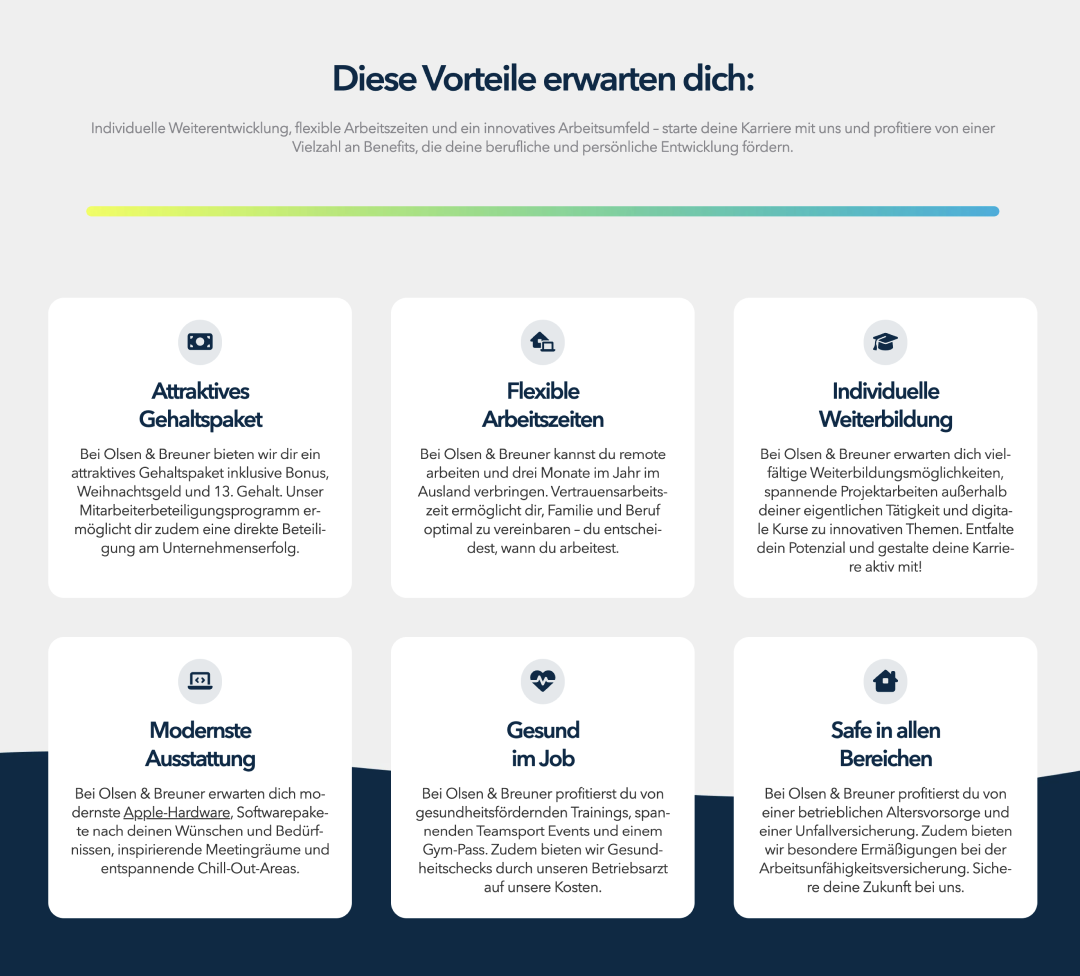
Show potential applicants at a glance what they'll get as employees at your company.
Ideally, list between four and six benefits, each with a short explanation (what exactly does "flexible working" or "modern equipment" mean at your company?). Make sure all the texts are of consistent length.
Subsidiaries/companies
Module recommendation: Cards, Chapter, Gallery
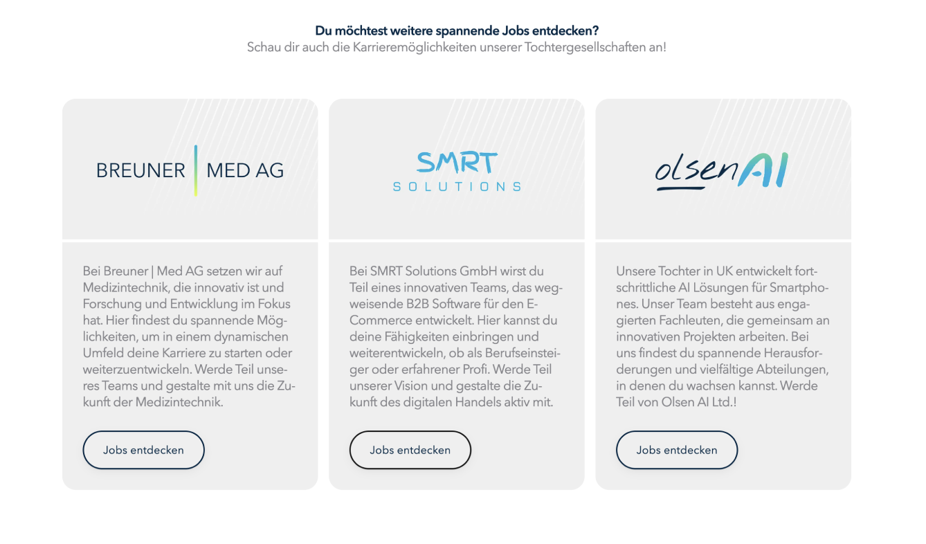
Introduce your subsidiaries or companies here.
When users click the call-to-action button, send them directly to a pre-filtered results page so that all positions from the selected company are visible at a glance.
Additional information
Module recommendation: Cards, Chapter, Gallery
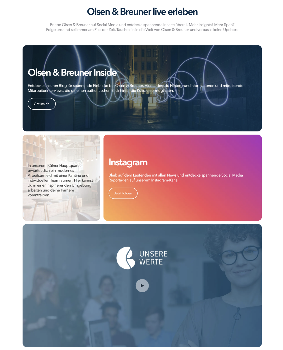
Introduce your company in a bit more detail: your values, your office, joint events, social media channels, trade fairs, etc. Use four to a maximum of six different points for this.
Application process
Module recommendation: Hiring process
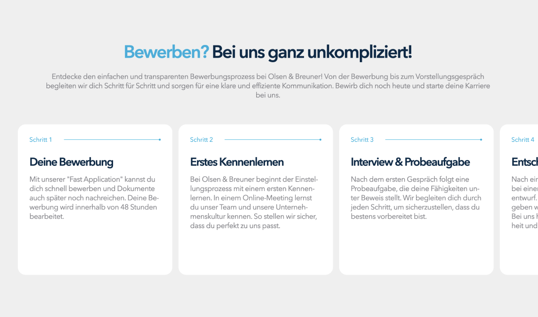
It's important for applicants to know what steps await them after applying. Present your application process here briefly and precisely. If it differs between individual job groups, refer to the respective job detail pages that describe the process in detail.
Entry point to job families
Module recommendation: Gallery, Cards, Chapter
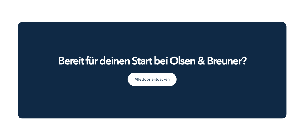
With a lot of content on the homepage, it's recommended to repeatedly use further calls to action to simplify the candidate journey for your potential applicants.
FAQs
Module recommendation: FAQ
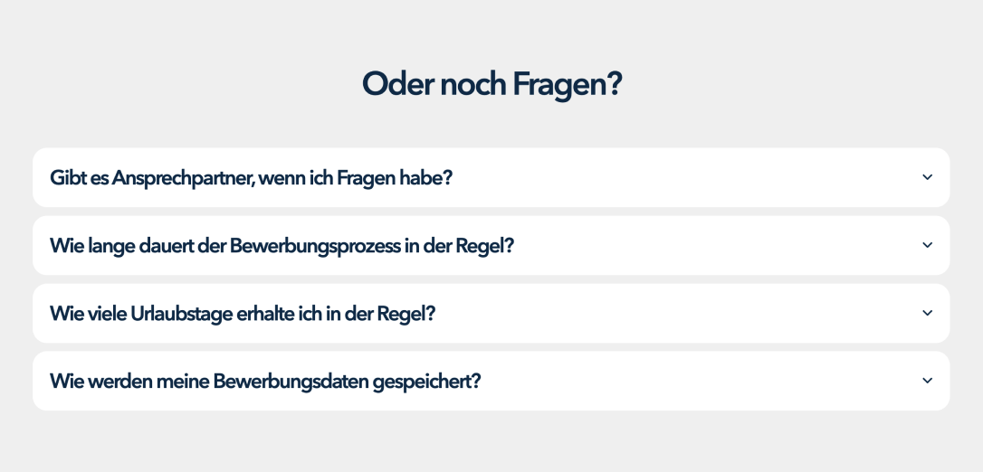
Do you keep getting the same questions about the application process or about working at your company? Summarise these in the FAQs to give potential applicants all the answers in one place, while also taking the load off your recruiters.
Was this article helpful?
That’s Great!
Thank you for your feedback
Sorry! We couldn't be helpful
Thank you for your feedback
Feedback sent
We appreciate your effort and will try to fix the article